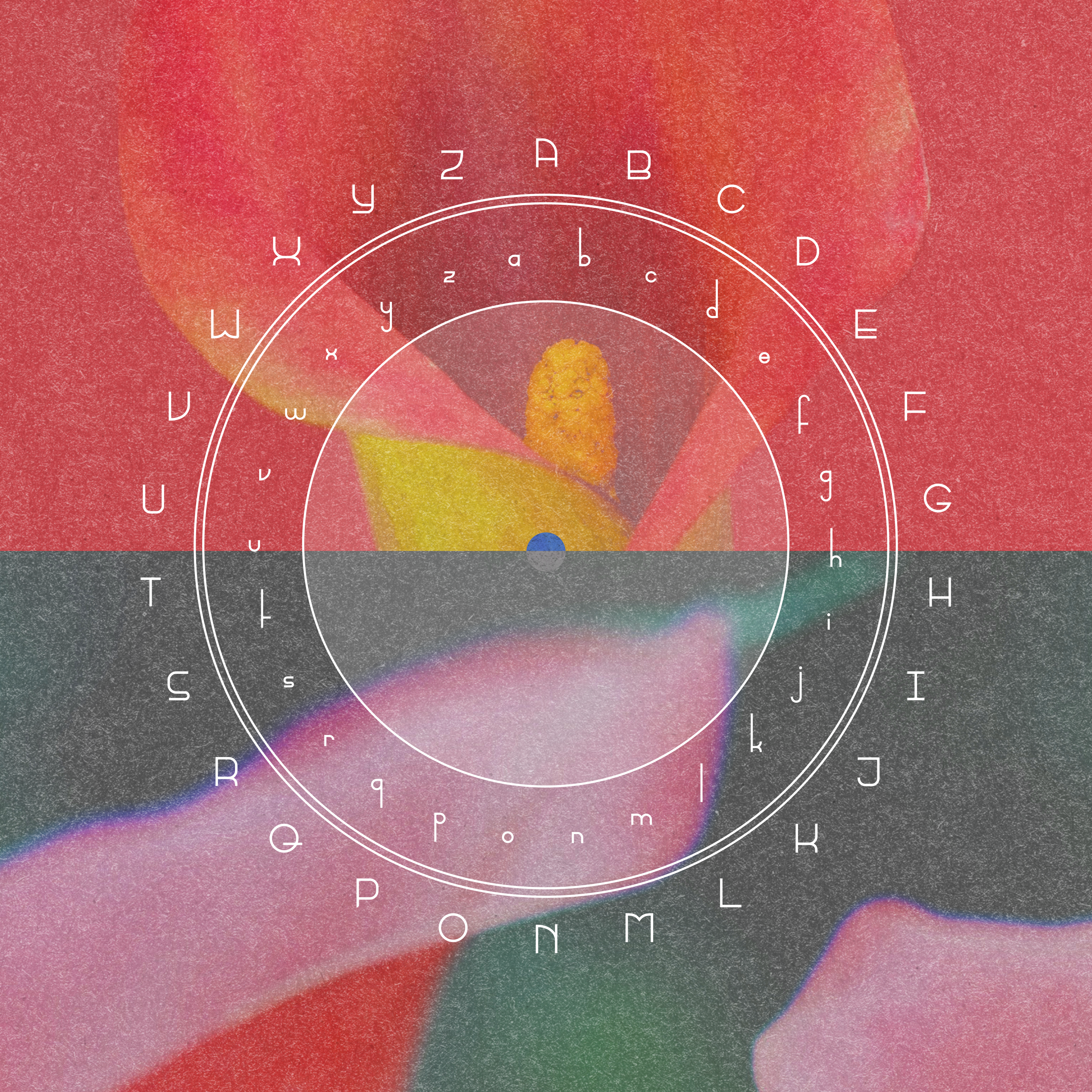
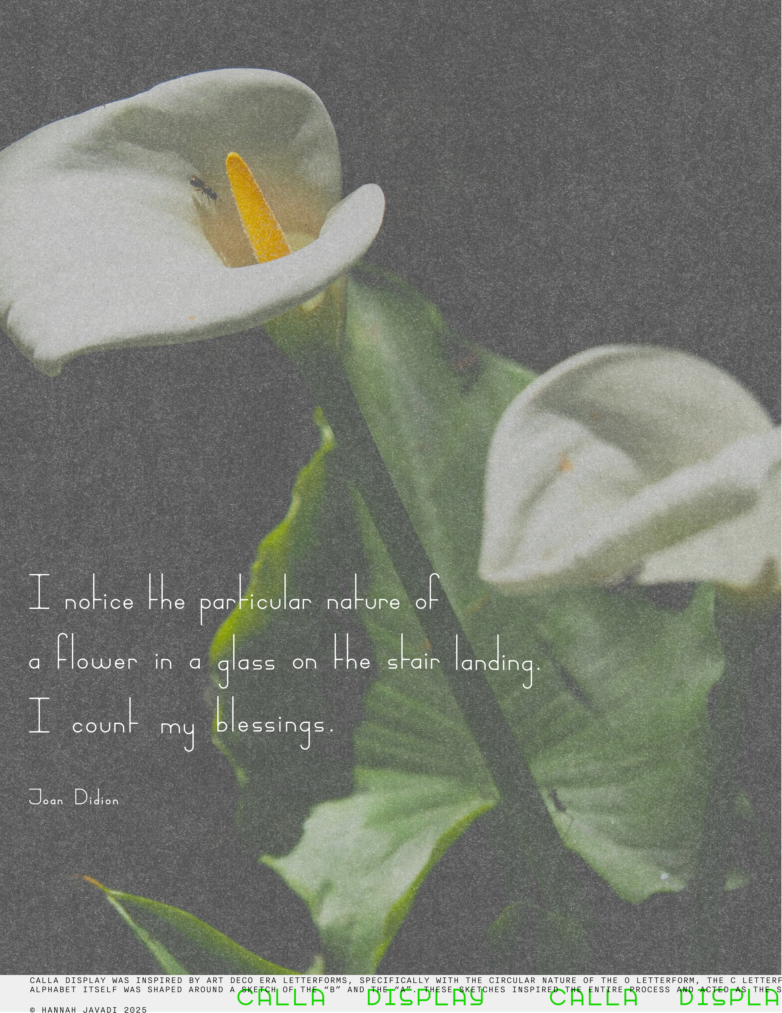
Calla Display
LETTERFORM DESIGN
ART DIRECTION
PUBLICATION DESIGN
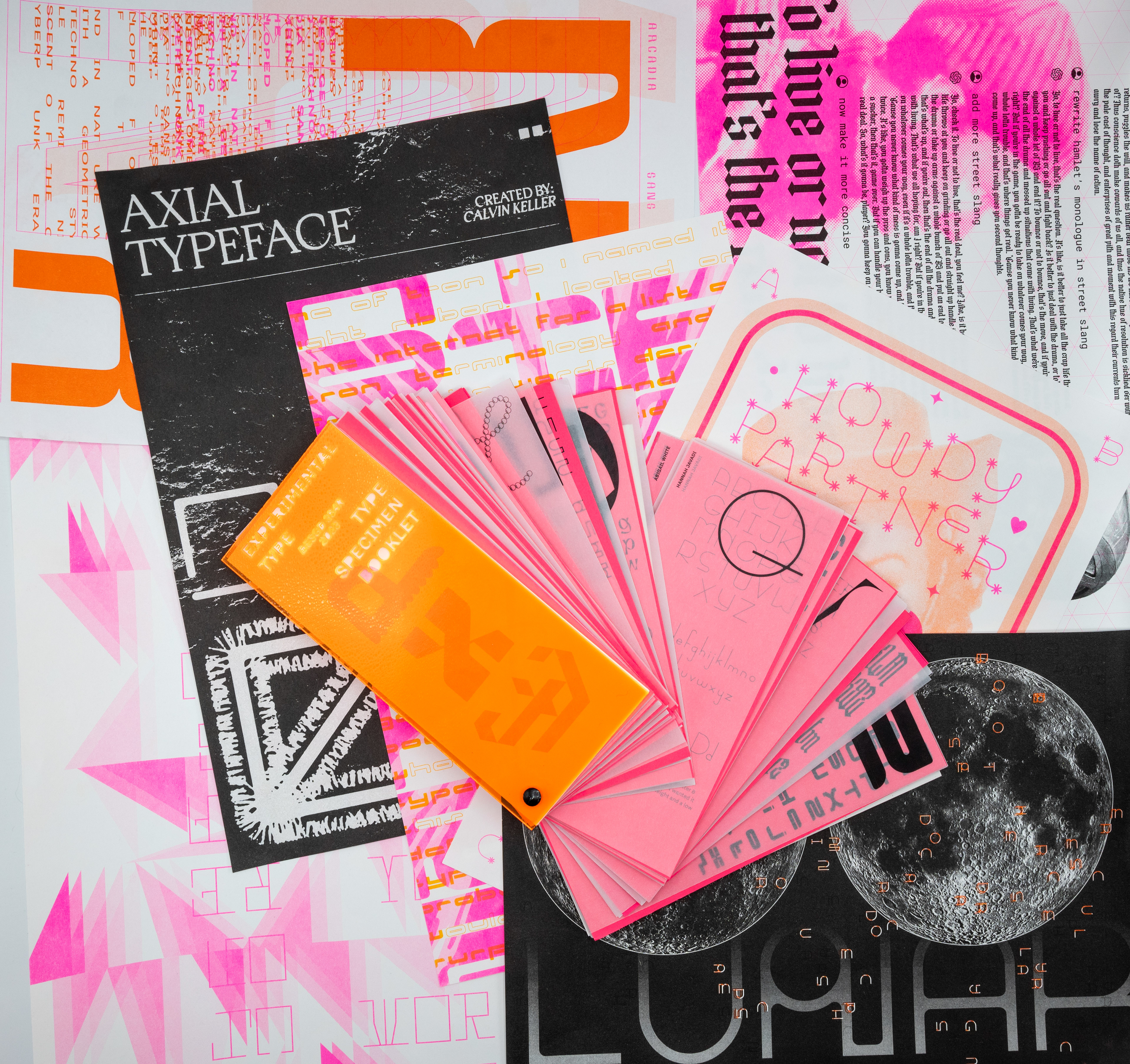
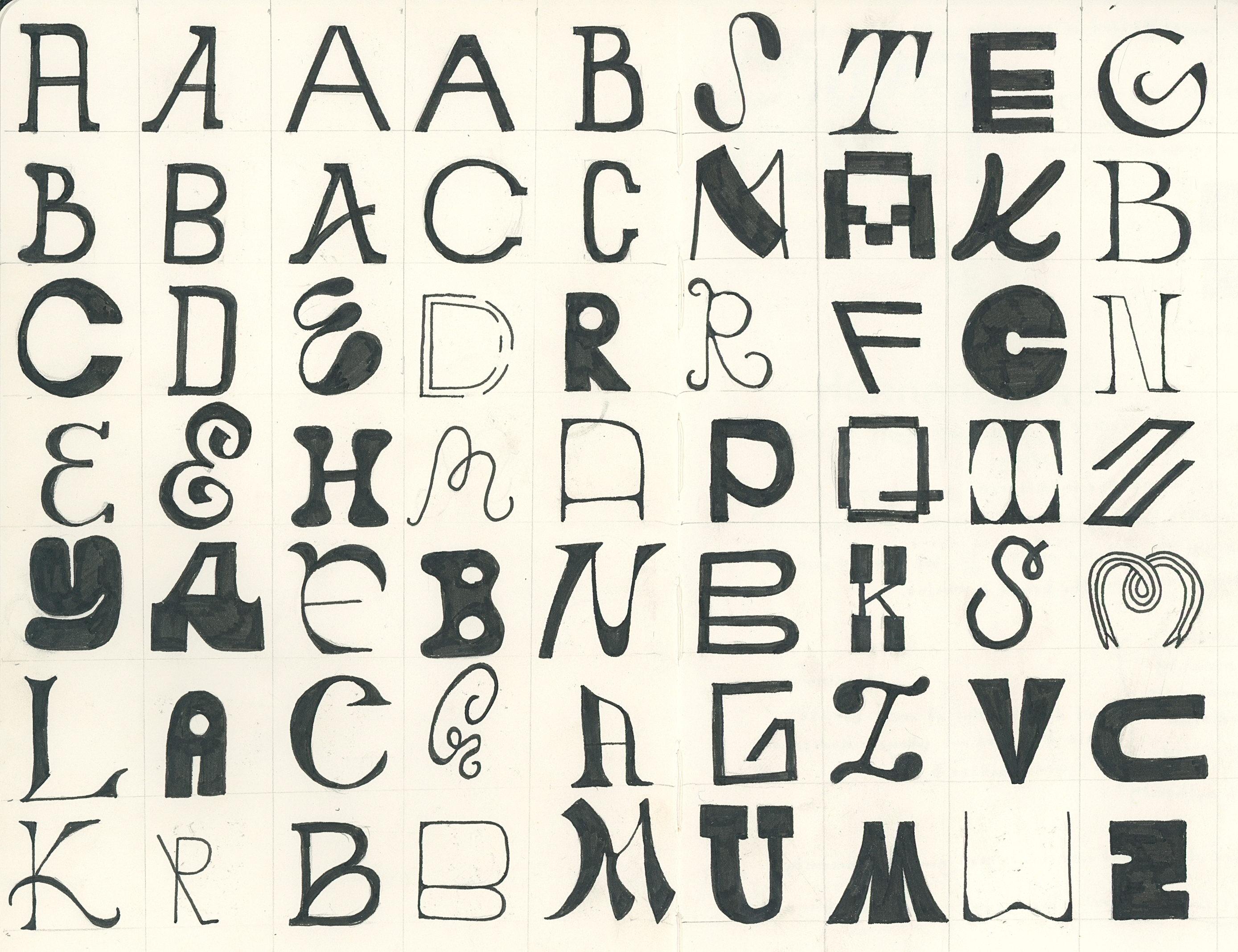
A custom, weird, and imperfect typeface I created inspired by the organic nature of flowers. I wanted to juxtapose their generally undulating, round compositions with Art Deco letterforms. Seemingly odd, but this concept — as well as the name “Calla Display” — were chosen to remember the life of a friend who loved both Calla lilies and Art Deco architecture. After the completion of this typeface and as part of a collaborative project, I led the design and production of a type specimen book, filled with every participant’s custom typeface and a riso-printed type specimen poster.


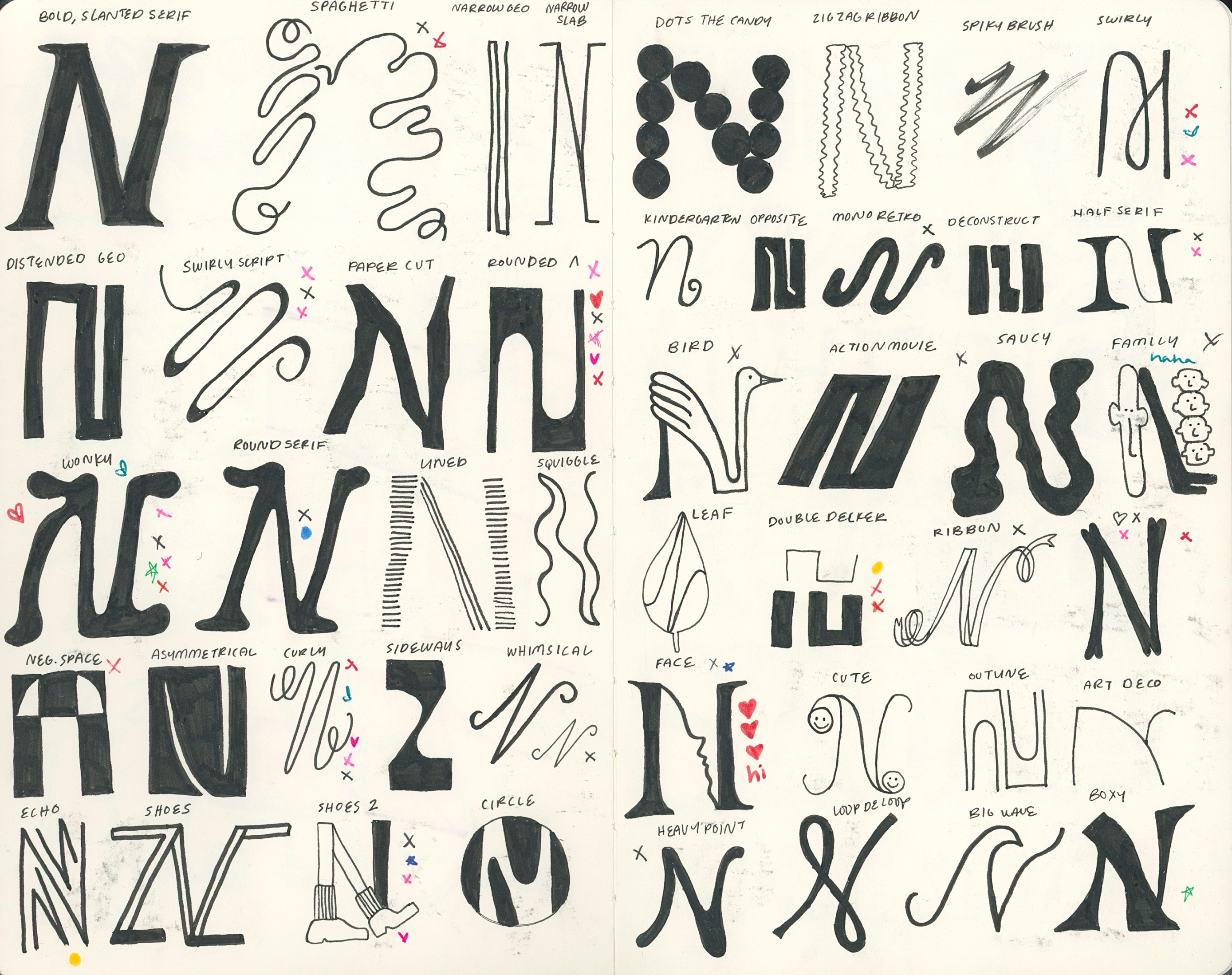
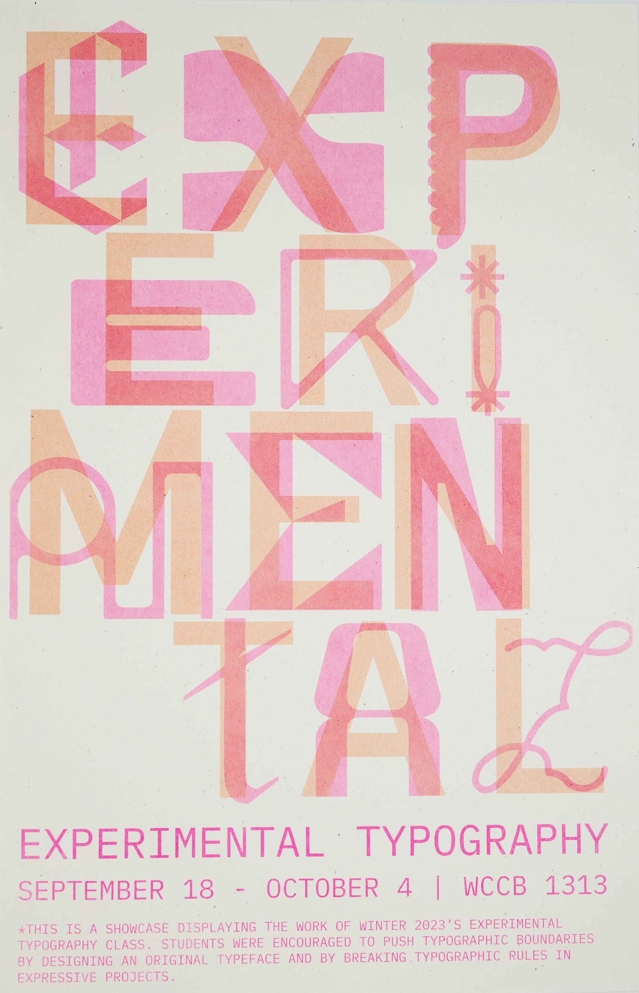
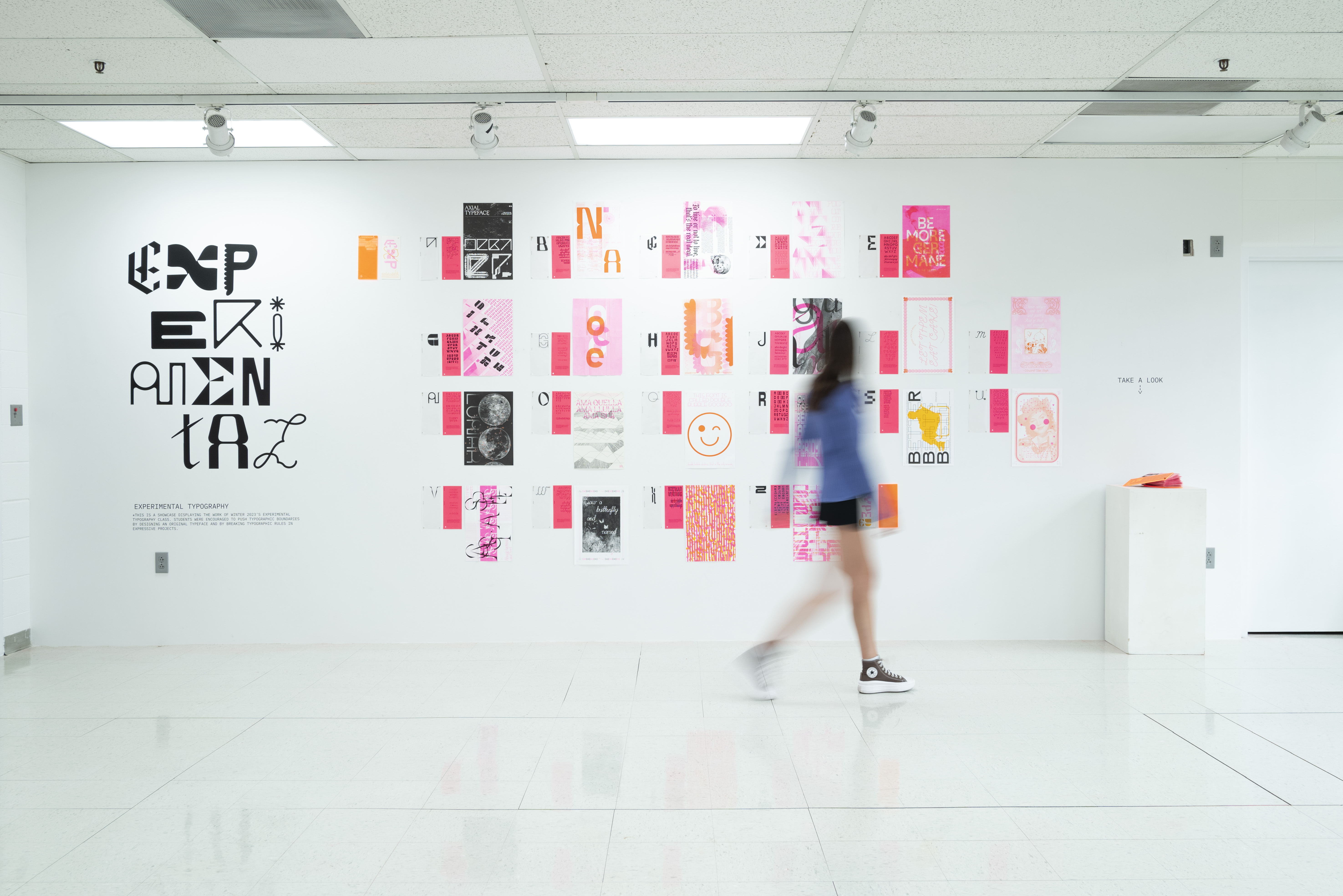
Type Specimen Book & Gallery Installation: